T-Squared Social
A brand built to travel, without starting over.
- Role
- Brand strategy, positioning and digital architecture
- For
- T-Squared Social, with NEXUS Luxury Collection
- Years
- 2025 to now
- Explore
- tsquaredsocial.com
The challenge
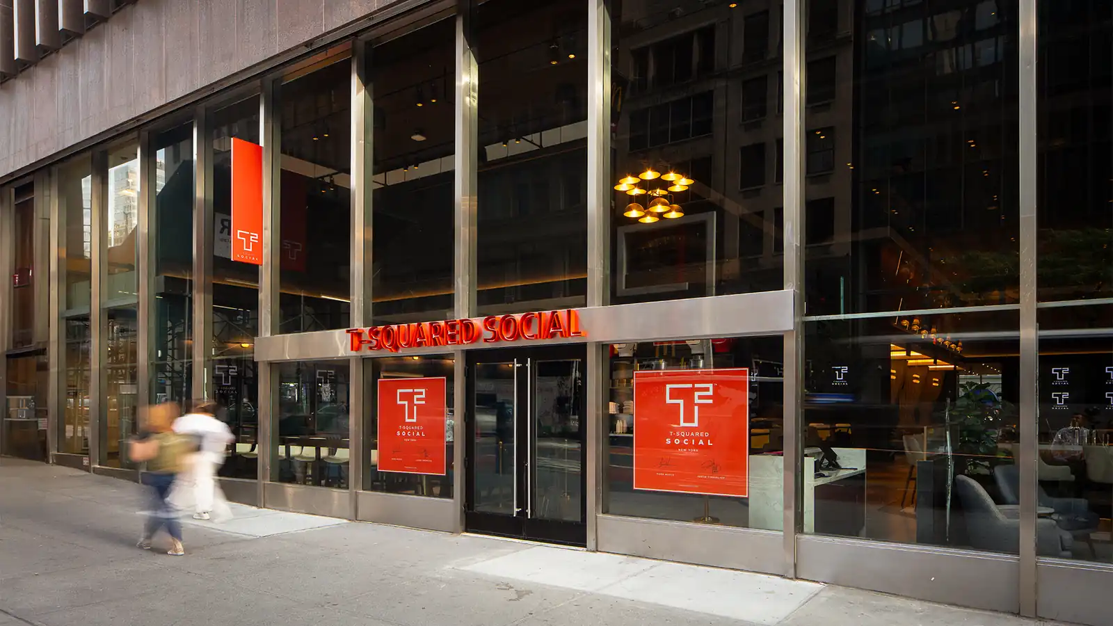
T-Squared Social started with two founders who couldn't be more on brand: Tiger Woods and Justin Timberlake, two of the most competitive, most social people anywhere, together with NEXUS Luxury Collection. The flagship opened in Midtown Manhattan, and the story was theirs. T². Their initials.
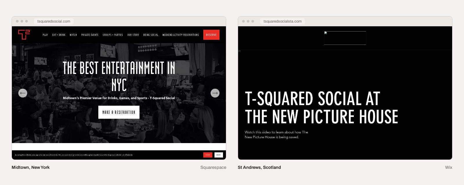
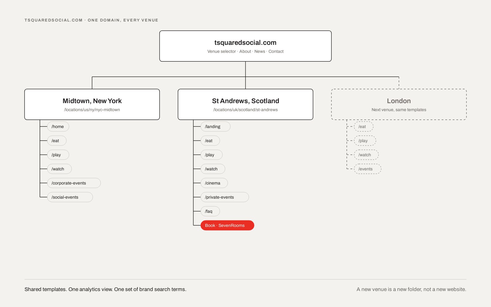
Then the brand started to grow. A second venue opened inside the New Picture House in St Andrews, with a website of its own. London was next, licensing conversations were starting, and more US locations were on the list. The question became how a brand built on two famous names keeps that foundation and still travels to places where the experience has to speak first.
The constraint
There was a lot worth keeping. The name, the logo, trademarks registered in a number of countries, the domains and handles, and two venues guests already knew. Throwing any of that out would have cost more than it fixed. This had to be a repositioning, not a rebrand. And the founders were never something to move past. They're the reason the brand exists.
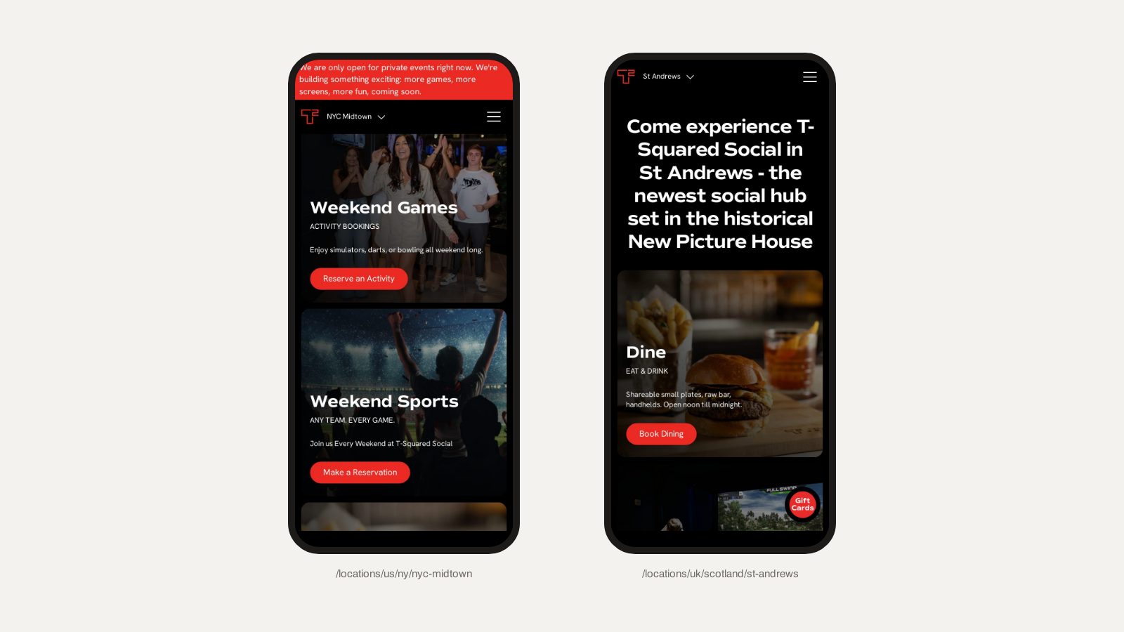
Each venue also had to keep its own character. A club in Midtown and one in a converted cinema in Scotland don't run the same menu, the same hours or the same nights.
The decisions
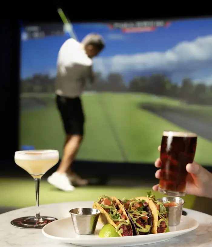
Keep the foundation and build on it. T² still carries Tiger and Justin's initials. It now carries a second meaning too: Time Together, the competitive, loud, fully present kind most nights out are missing. That's what the two of them were after when they started it. The founders stay at the center of the origin story, and the experience can stand on its own wherever the brand goes next.
Four principles carry it. Time together, not time spent. Loud over polished. Shoulder to shoulder over face to face. Famous for the feeling, so it never depends on any one name. NEXUS Studio built the 2026 brand guide around them.
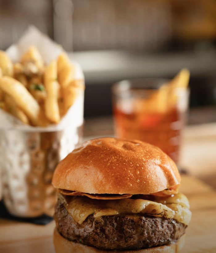
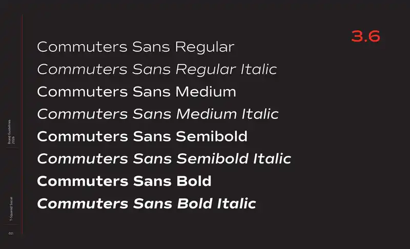
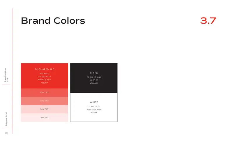
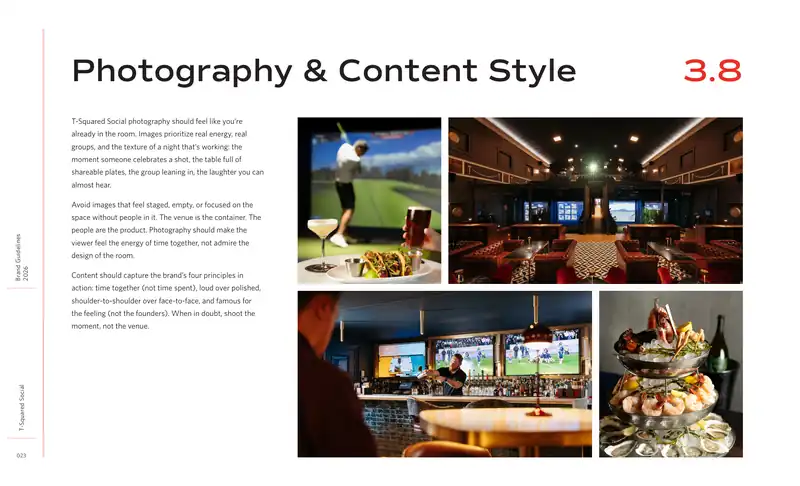
The voice is energetic, not chaotic. Warm, not soft. Competitive, not exclusive. Present, not performative. Photography shoots the moment, not the venue, because the people are the product. The identity stays exactly as it was: the T² mark, Commuters Sans, T-Squared red, black and white.
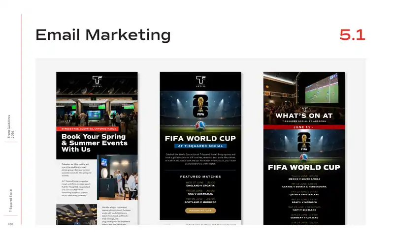
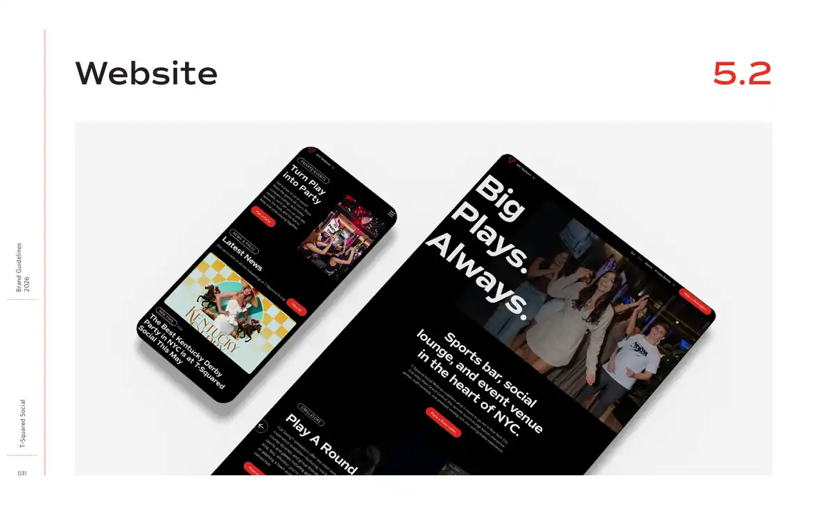
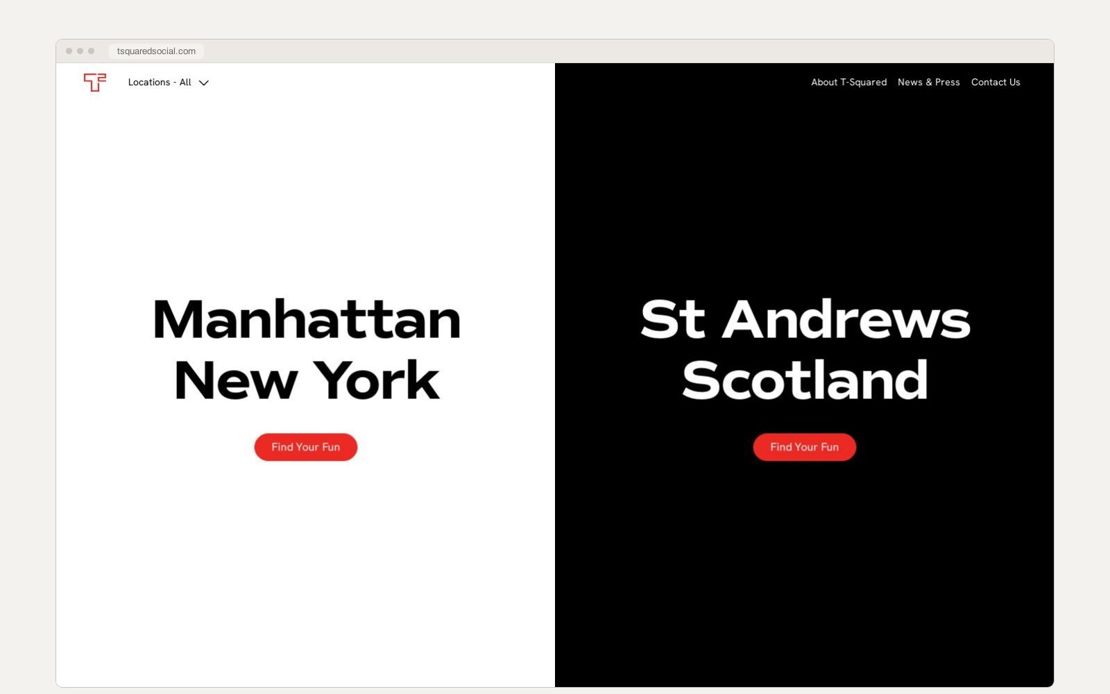
Then the brand needed one home. I brought both venues onto tsquaredsocial.com: one domain, a path for every location, shared templates and one set of numbers. For St Andrews, I played a lead role in building the reservation platform on SevenRooms. The thinking behind the site has its own essay.
The last ten percent 99
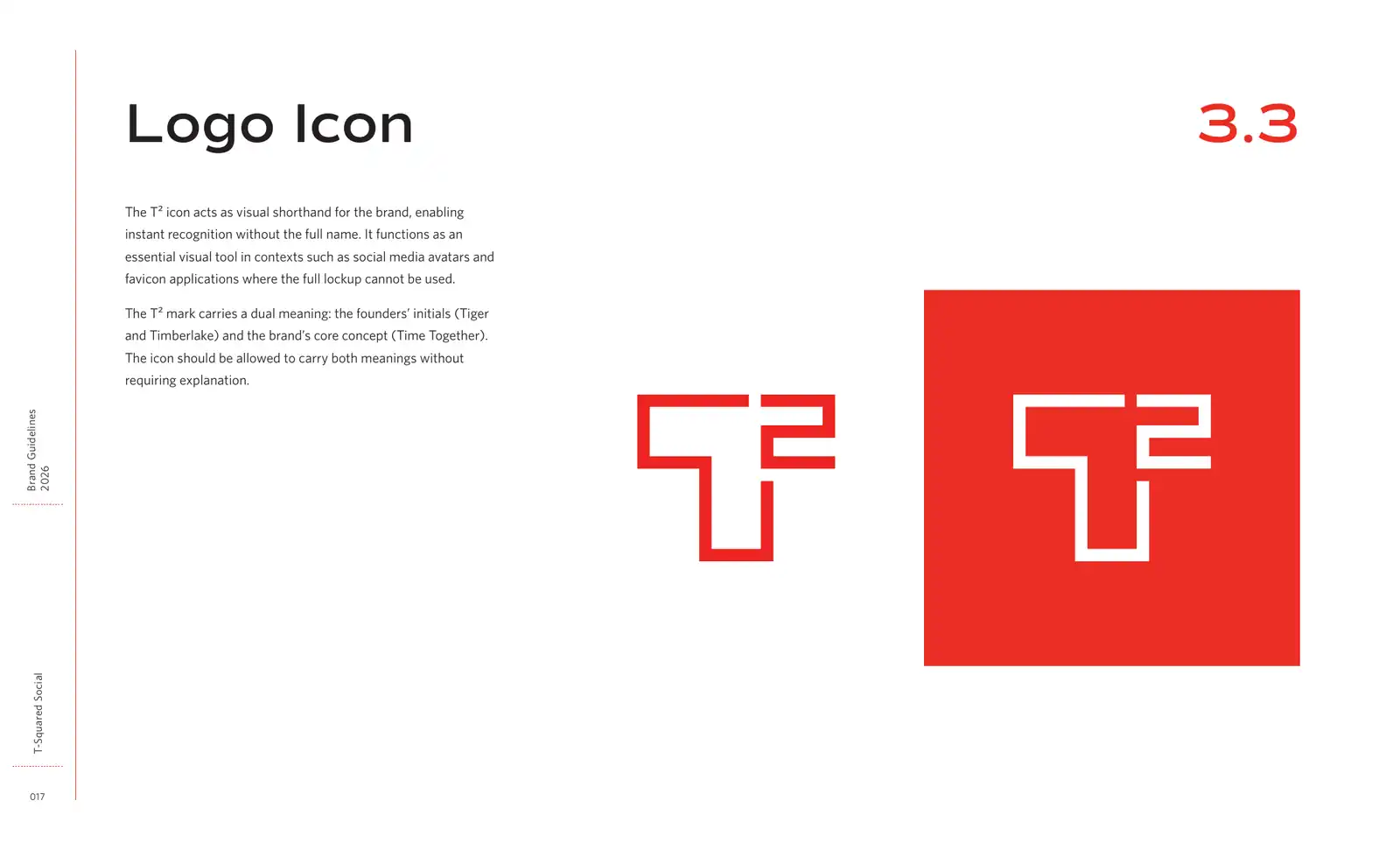
The mark itself. We didn't redraw a single line. T² still stands for two founders, and now it also stands for Time Together. The guide lets the mark hold both meanings without explanation, so the brand can lead with either one, depending on the room.
What changed
Every team, venue and partner now works from one story, one standard and one address. The brand reads the same in Midtown, in St Andrews and on a phone, and each venue still sounds like itself. When London opens, it opens on a story that stands on its own.
Credits. Brand guide, design and production: NEXUS Studio. Reservations: SevenRooms.