The challenge
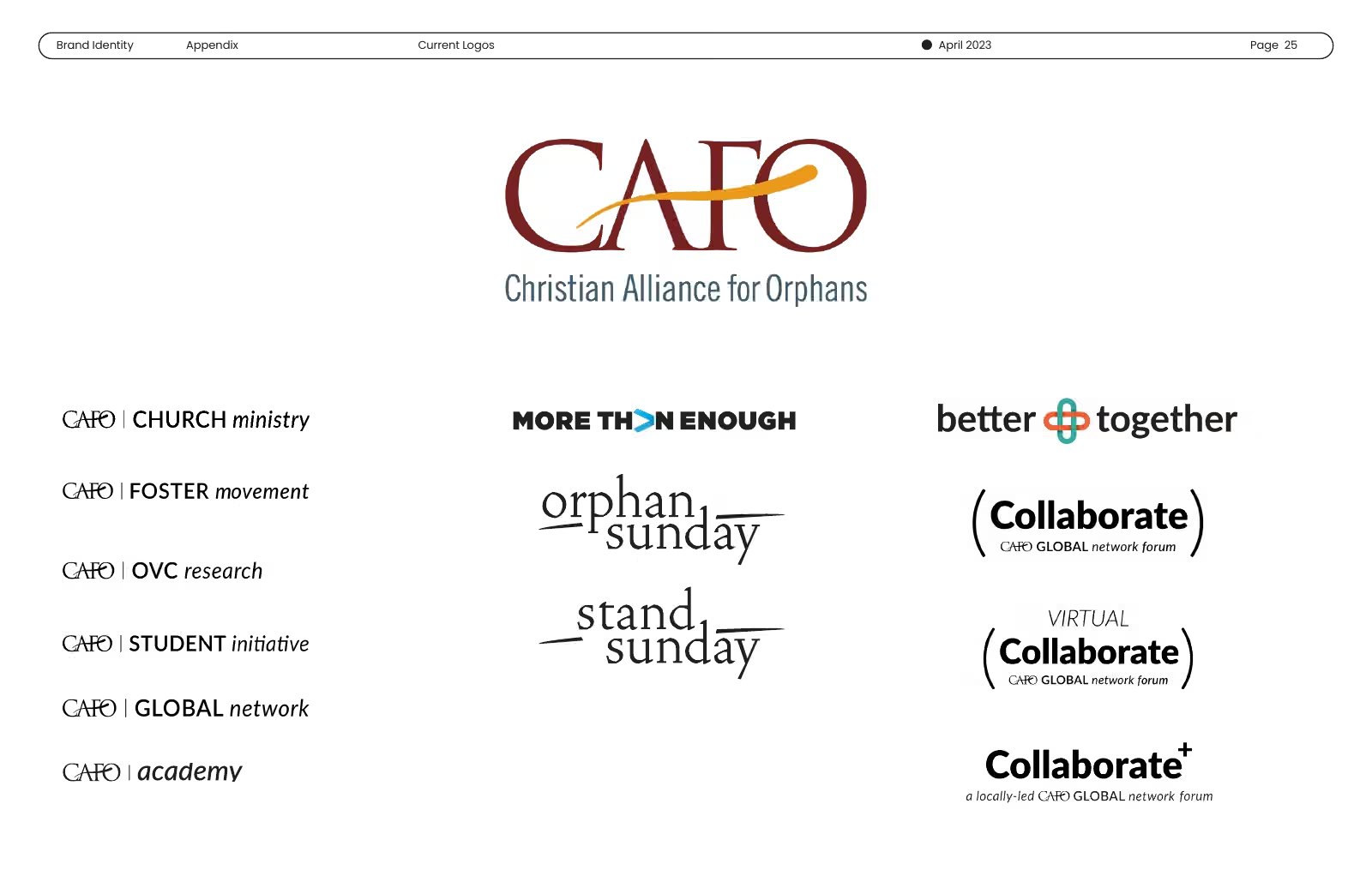
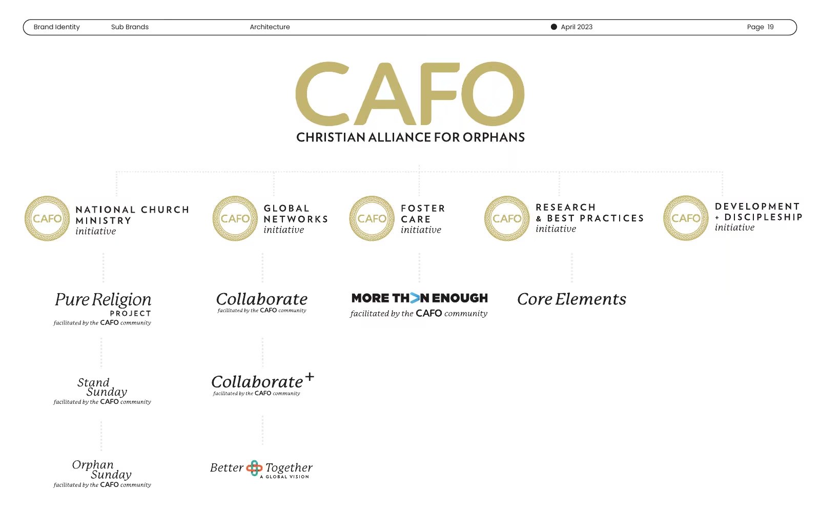
CAFO is an international alliance working on behalf of vulnerable children: a parent organization, eight initiatives and a wide network of member organizations. Over time, each initiative had grown its own name, its own look and its own way of talking. A supporter could give to three of them and never know they were connected.
The constraint
The eight initiatives served eight different audiences. Each spoke to a different supporter and did its own part toward the shared goal, and every one had earned the right to sound like itself. Folding them into one look would have cost each of them what made it work.
The decisions
I’d spent years leading creative strategy and design inside CAFO. In 2023, after I’d left, I rebuilt the whole brand and its architecture through Anon, knowing exactly where the seams were.
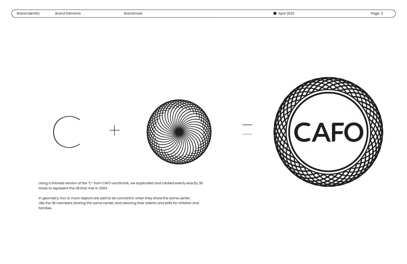
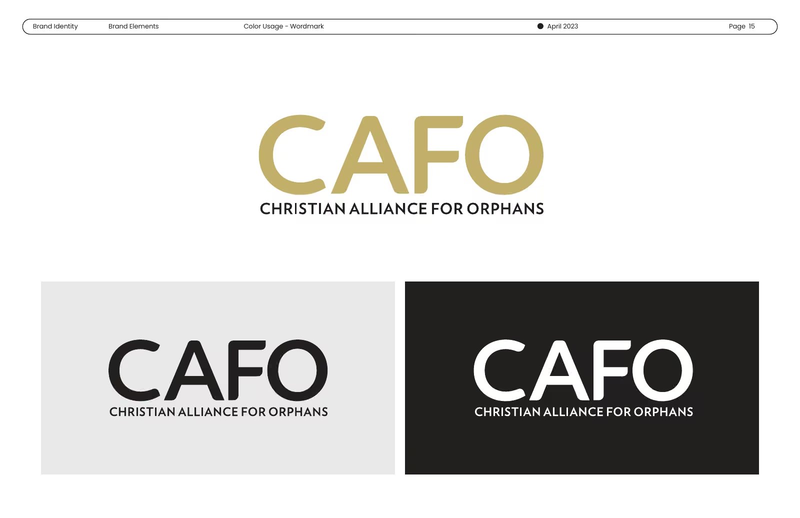
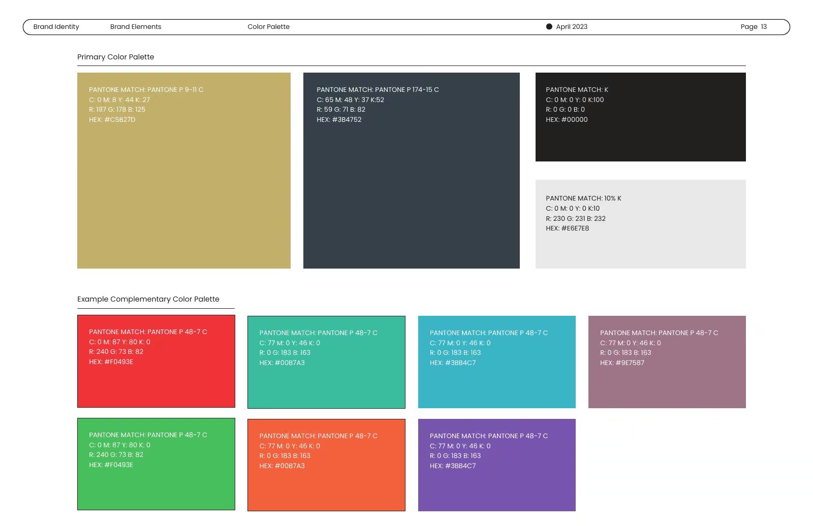
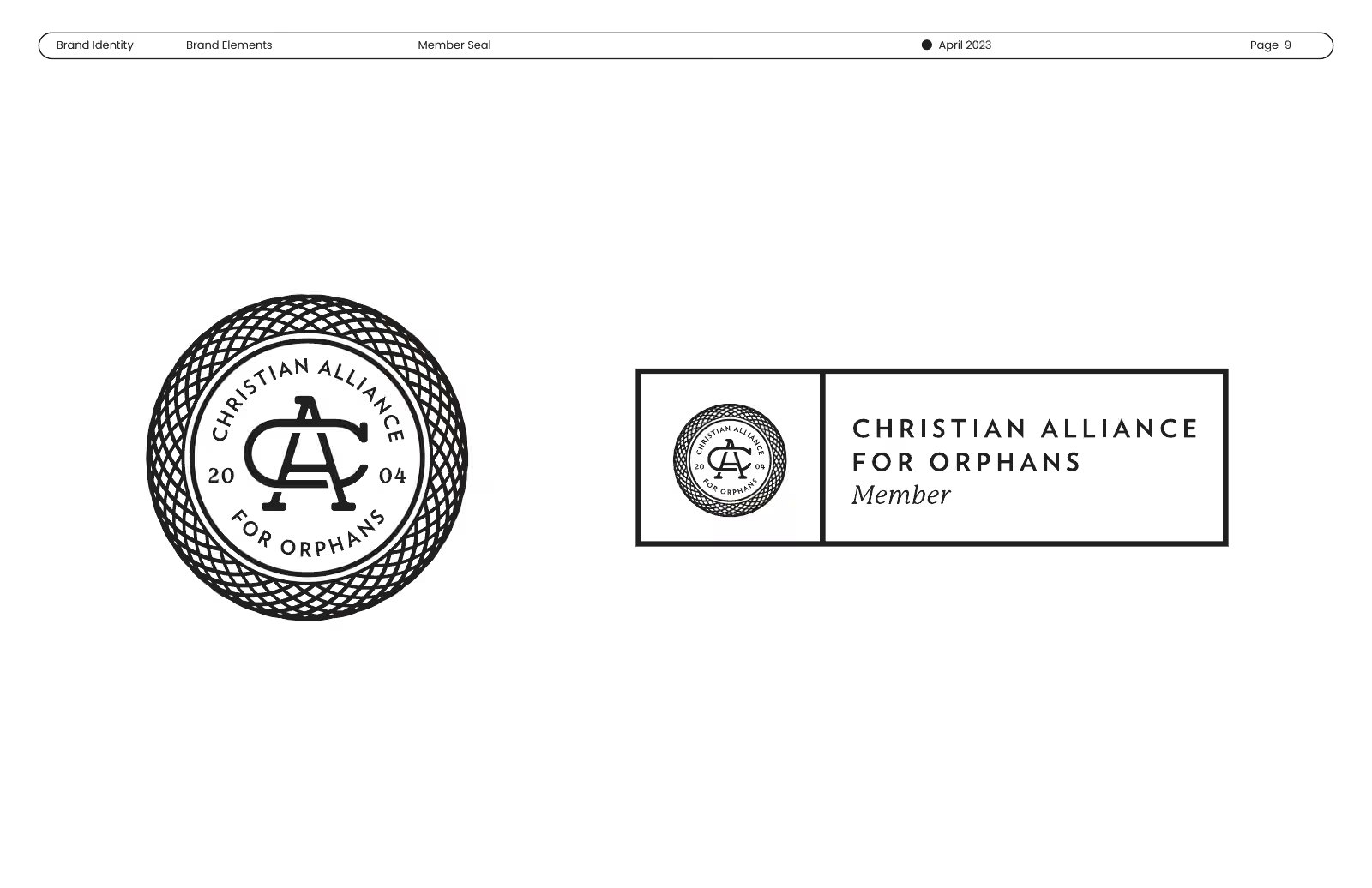
The parent was redrawn first, and its new wordmark runs in gold on light and dark grounds. Then each initiative kept its own name, cause and audience, and took the parent’s seal as its tie back.
Getting that tie right across eight very different causes was most of the work. It had to be clear enough that a supporter recognizes the family instantly, and light enough that no initiative feels like a sub-brand.
Credits
Design: Karl Dinkler, through Anon.
The essay, in Plain Spoken
Next
Lake HighlandSeven years of campaign work for a forty-million-dollar goal, all of it written from one line.